
404 Error
This page does not exist.
Popular pages
Documentation
Learn how to use our popular Google Workspace add-ons
Products
Explore addons for Gmail, Drive, Google Sheets and Forms
Google Apps Script
Learn automation and do more with your Google Workspace
Tech Blog
Read our latest tutorials and how-to guides
Awards & Titles
Digital Inspiration has won several awards since it's launch in 2004.

Google Developer Expert
Google awarded us the Google Developer Expert award recogizing our work in Google Workspace.

ProductHunt Golden Kitty
Our Gmail tool won the Lifehack of the Year award at ProductHunt Golden Kitty Awards in 2017.

Microsoft MVP Alumni
Microsoft awarded us the Most Valuable Professional (MVP) title for 5 years in a row.
Google Cloud Champion
Google awarded us the Champion Innovator title recognizing our technical skill and expertise.
Video Tutorials
Subscribe to our YouTube channel and get notified whenever we upload a new video tutorial.
 Send Confirmation Emails with Google Forms
 Create Mail Merge with Gmail and Google Sheets
 Automate Document Workflow with Google Forms and Sheets
 Request e-Signatures with Google Forms
 Save Gmail Emails to Google Drive
 Email Google Sheets Automatically
 Create Photo Badges with Google Slides
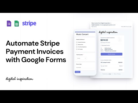 Send Stripe Invoices with Google Forms
 How to Sell Digital Goods with PayPal and Google Sheets
 Google Apps Script - A Developer's Guide
 Convert Google Slides to Video and Animated GIFs
 Rename File uploads in Google Forms
 File Upload Forms for Google Drive
 Dictation - Type with your Voice
 YouTube Video Uploader for Teams
 Limit Google Form Responses Automatically
 Create PDF Documents from Google Forms
 How to Hide Files inside Google Drive
 Create Merge Documents with Google Sheets or Google Forms
 Create PDF Documents with Images and QR Codes
 Send Unique File Attachments with Mail Merge for Gmail
 Print Password Protected PDF Files
 Embed Google Photos in your Website
 Create Emoji Art with Google Sheets
Google Add-ons
We build bespoke solutions that use the capabilities and the features of Google Workspace for automating business processes and driving work productivity.
Send personalized email to your contacts with Google Sheets & Gmail

Create pixel perfect documents from Google Sheets and Google Forms

Download emails and attachments from Gmail to your Google Drive

Send email to respondents when they submit your Google Forms

Email entire spreadsheets, selected cell ranges or send dynamic charts on schedule.
Turn your Google Slides presentations into animated GIF images and videos

Email Newsletter
Sign up for our email newsletter to stay up to date.
We will never send any spam emails. Promise.