The world has more Internet enabled mobile phones than computers but still, we often spend more time testing our site’s design on desktop browsers than mobile screens. We are more curious to know if our site looks good on the Windows version of Safari browser than say on an Android phone though more users could be accessing our site through the latter option.
There are only three major desktop operating systems and four major desktop browsers. Plus we have excellent tools like Browser Shots and Adobe’s Browser Lab that help us understand how our website design looks like across all the permutations and combinations of desktop browsers and OSs. The mobile universe on the other hand is much bigger and unfortunately, there aren’t any equivalent tools available to help you test site designs across different mobile browsers and mobile OSs.
There are however a couple of good options that will let you test your site design on the most popular mobile OSs without you having to own the device.
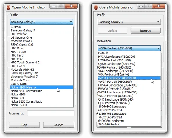
My first recommendation is the brilliant Opera Mobile Emulator – just choose your mobile device name from the available profiles and hit the Launch button to open the mobile browser on your desktop. The browser will resize itself according to the resolution of the selected mobile device and you just have to type the site’s URL in the address bar to get an idea about how that site might look like on a actual mobile phone.
Opera Emulators includes presets for a couple of tablet devices as well like the Galaxy Tab and Motorola Xoom. If your mobile device isn’t listed, you can setup a new profile using a custom screen resolution and pixel density (or the default zoom level).
The Opera Emulator will render web pages as mobile Opera but you can also change the browser’s default User Agent string to make it appear like an Android or Nokia S60. Just click the Opera logo in the lower right followed by Settings to change the browser’s default User-agent string.
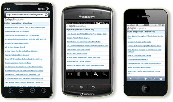
The next best thing for testing your site design on a mobile phone is Mobilizer.
This is an Adobe AIR app that help you preview your site design on popular smart phones like the Apple iPhone, Palm Pre, HTC Evo and BlackBerry Storm.
You can open any number of instances of different mobile phones on your desktop and they either stay synchronize (you click something on one device and others follow suit) or they can be used independent of each. You can right-click a device to export the render as a PNG file.
What’s also unique about this tool is that you can even drag a local HTML page or image and test their design before putting them on the public web.
Also see: Test your Website Design on an iPad


